당사는 2023년 10월에 개최 된 제 5회 국제치안산업대전에 참가하였습니다.
국제치안산업대전은 국내 최초 경찰청이 주최하는 치안 산업 전문 B2B전시회로, 4차 산업혁명 시대에 동아시아 유일의 치안산업박람회 입니다.
소프트웨어 개발 서비스
당사는 2023년 10월에 개최 된 제 5회 국제치안산업대전에 참가하였습니다.
국제치안산업대전은 국내 최초 경찰청이 주최하는 치안 산업 전문 B2B전시회로, 4차 산업혁명 시대에 동아시아 유일의 치안산업박람회 입니다.
My internship at Mintech lasted two months, and during this time I made lasting connections with coworkers and learned extensively about front-end development.
When I first entered the company, I brought with me my knowledge from classes in college, where I mostly learned popular algorithms and important concepts such as dynamic programming and pipelining; however, I did not put these ideas to use at Mintech as I mainly worked on the “AngelRobotics” project: a front-end UI for a user and robot management website. This was the first time I worked with React JS or more specifically javascript, html, and css. While I was daunted at first by the new languages, I came to quickly realize that javascript was extremely similar to other languages like C++ that I had learned before. Additionally, on the first day of work, I took a mini tutorial of React that managed to kickstart me in the right direction and subsequently, I learned more on my journey. On the other hand, html and css came easily and it was extremely satisfying to see the physical results.
The project I worked on was in conjunction with the client company AngleRobotics. I created the front-end website and connected HTTP requests to display the data online using REACT JS; meanwhile, my correspondent at AngelRobotics worked on the backend, or more specifically the API in Node JS. The biggest problem that arose during the project was the difficulty in communicating with each other, as I was obviously much more comfortable and fluent in English, and my opposite was fluent in Korean. It also did not help that both him and I were quite new to backend and frontend coding, respectively, which led to even more confusion. Nevertheless, I tried to power through and in the process, learned much about React js and frontend coding.
One of the best parts of working at Mintech was the people I got to interact with. Coming from America, I was awkward with the social formalities and niceties required in Korea; however, my coworkers were extremely welcoming and the use of company nicknames helped me ease in with everybody. While I had the option to choose days I could work remote or in-person, I ended up commuting to the office almost every day even though the trip was around an hour long as I loved getting to know my coworkers better and having casual conversations with them. In the end, despite my inability to speak completely fluent Korean, I created everlasting bonds with everyone at Mintech. I will be forever grateful for this opportunity as I have learned so much-from business social skills to technical frontend coding-and will be sure to come visit again if I have the chance to come back to Korea. To 쑥, 오리, 양파, 와플, 바다, 베리, 쿠키, 책인님, 도리, 초코, and 브로콜리사장님: Good luck on all your future endeavors everyone and hope you continue to welcome all interns with open arms!
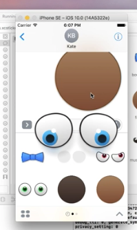
이 문서는 iMessege 용 스티커팩을 준비하는 디자이너를 위해 작성되었습니다.
크게 3가지 종류가 있습니다.
[table id=1 /]
준비해야 하는 이미지 사이즈는, 실제 보이는 이미지의 3배 크기의 이미지를 준비합니다. 레티나 디스플레이 아이폰에서 좀 더 선명하게 보이기 위해서 입니다.
파일포맷은 배경이 투명한 png 파일 포맷으로 합니다. 하나의 파일이 500kb 를 넘으면 안됩니다.
준비해야 하는 스티커의 최소 갯수는 없습니다.
애니메이션은 위 사이즈와 동일한 gif 파일을 만들어도 됩니다. 좀 더 잘 하려면, Xcode 에서 APNG파일을 만들 수 있습니다. 이 때에는 PNG 파일로 이미지 낱장을 준비한 다음 Xcode 를 사용하는 개발자에게 의뢰하도록 합니다.
gif 애니메이션과 APNG 파일의 차이는 APNG 파일이 좀 더 메시지나 이미지 위에서 지저분하지 않게 잘 보이게 된다고 합니다. 하지만, 그런 디테일이 필요 없다면, gif 로 해도 무방합니다.
아이콘이 의외로 좀 많이 필요 합니다.
[table id=2 /]
모두가 다 필요하냐구요? 네 모두 필요 합니다. 모두 다를 필요 없고 모두 같은 모양이지만, 사이즈만 다르면 됩니다.
주의할 사항은 파일 타입은 png 로 하되, 배경이 투명이면 안됩니다. 보통은 흰색 아니면 원하는 색을 넣어 줍니다. 그리고, 필요한 경우 아이콘은 자동으로 라운드 처리가 됩니다. 그래서 귀퉁이 부분은 라운드 될 수 있다는 점에 주의합니다. (미리 라운드 처리 하면 안됩니다.)
앱스토어 올릴 때, 유료로 할 지 무료로 할 지 선택할 수 있습니다. 원한다면 부분적으로 인앱 구매로 처리할 수 있습니다. 이 부분은 앱스토어 올리기 전 결정하면 됩니다.
Sticker 는 기존 메시지버블에 떼어 붙이거나, 아니면 다른 스티커 위에 붙일 수 있는 개념입니다. 그래서, 메시지버블에 붙였을 때 잘 어울리거나, 아니면, 여러개의 스티커를 붙여서 하나의 스티커가 되는 조각단위로 디자인 하면 좋습니다.

이미지 외곽에는 흰색 아웃라인을 그려주면 좋습니다. 대부분은 흰색 배경의 채팅창을 쓰지만 모두가 그런 것은 아닙니다. 어두운 배경의 채팅창을 쓰는 경우도 있습니다. iOS의 메시지앱에서 스티커를 터치하면 흰색배경에 스티커를 볼 수 있고, 여기서 한번 더 터치하면, 검은 배경에 전체 화면으로 스티커를 보여줍니다. 이 때, 흰색 배경만 고려했다면, 애매한 부분이 더 확연히 들어날 보입니다.


위 사이즈로 이미지를 준비하면 됩니다. 문제는 Telegram 에서는 무료 스티커팩 만 만들 수 있습니다. 아직 유료는 지원하지 않습니다.